Journal
Interview: Tim Schmeer
Oct
In conversation with Tim Schmeer on Graphic Design and typography.
Creative journey
I was born in the mid-eighties in Düsseldorf, Germany. My work includes drawing, graffiti-writing, photography, Graphic Design and typography. Since early childhood I was fascinated by expressing myself artistically in unconventional ways, but it took some time and a few detours to turn this into a career. You could say I am a late starter.
Initially I trained as an ergo-therapist and worked in hotels before design as a discipline was even on the horizon. However, following a few coincidences, I enrolled at the communication design department at the Peter Behrens School of Art (PBSA) in Düsseldorf. Coming from healthcare, I had no preconceived ideas of design, let alone any kind of experience. At the beginning of my journey into the creative world, I very much focused on photography. Certainly I noticed other disciplines, but I tried to be good at one thing first and felt I am just scratching surfaces in those other areas of expression. Around the same time I started working on small commercial jobs in the fashion industry.
After my BA and gaining some rather discouraging experiences in the creative industry, I felt there is a lot more to discover. I started questioning what I was doing as a so-called ‘professional’ and became more interested in the relationships between design and art, as well as design methods in artistic research and as a form personal expression. Conventional design practice started to loose its appeal and at the same time my passion for photography begun to fade. In consequence I enrolled at the PBSA once again to pursue an MA focussing on typography. Mostly through sketching and mark-making I quickly developed a certain unconventional approach to type which was driven by an interest in testing out the boundaries between personal expression, functionality and academic knowledge. My mentor at the time, professor Holger Jacobs, who regularly flew in from London, strongly supported this experimental approach. In my final year I changed perspectives again by working closely with professor Gabi Schillig , who actually came from an architectural and spacial design background. It was a perfect combination and helped me to understand typography merely as form-giving or shaping rather than a purely semantic tool. My final project concluded in an extensive body of work bringing together various typographic experiments, including books, catalogues, posters, spacial objects, texts and spacial designs: formstudie (experiment): zeichen, raum, objekt.
After graduation, Holger Jacobs suggested I should come to London and organised and got me into Spin Studio as an Intern. I not only met wonderful people from all over the world and worked on exciting projects, one day I was also introduced to Vaughan Oliver and his work which served as a great inspiration. Subsequently at Spin I mainly worked on the Vaughan Oliver book going through all his archives. This short, but very intensive period left a long lasting impression on me and affected my work as well as my personal understanding of design.
Since 2018, I work as full-time freelance graphic designer and typographer based in Düsseldorf, Germany. I also gathered first experiences in lecturing and running workshops on experimental methods in typography and graphic design at universities and private institutions in Düsseldorf and Berlin. Recently Holger and I founded ‘We Love Bondage’ – a collaboration set up in order to explore the possibilities of a much more artistic and experimental practice in commercial design.
Every XYZ is a new ABC
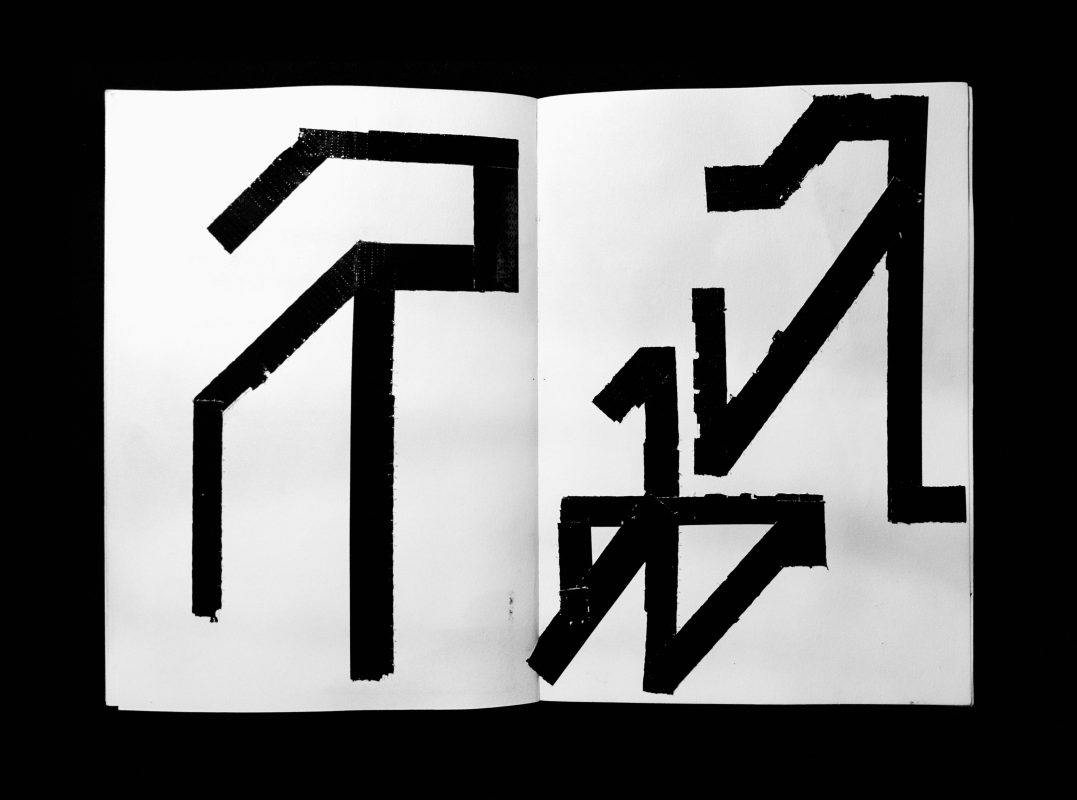
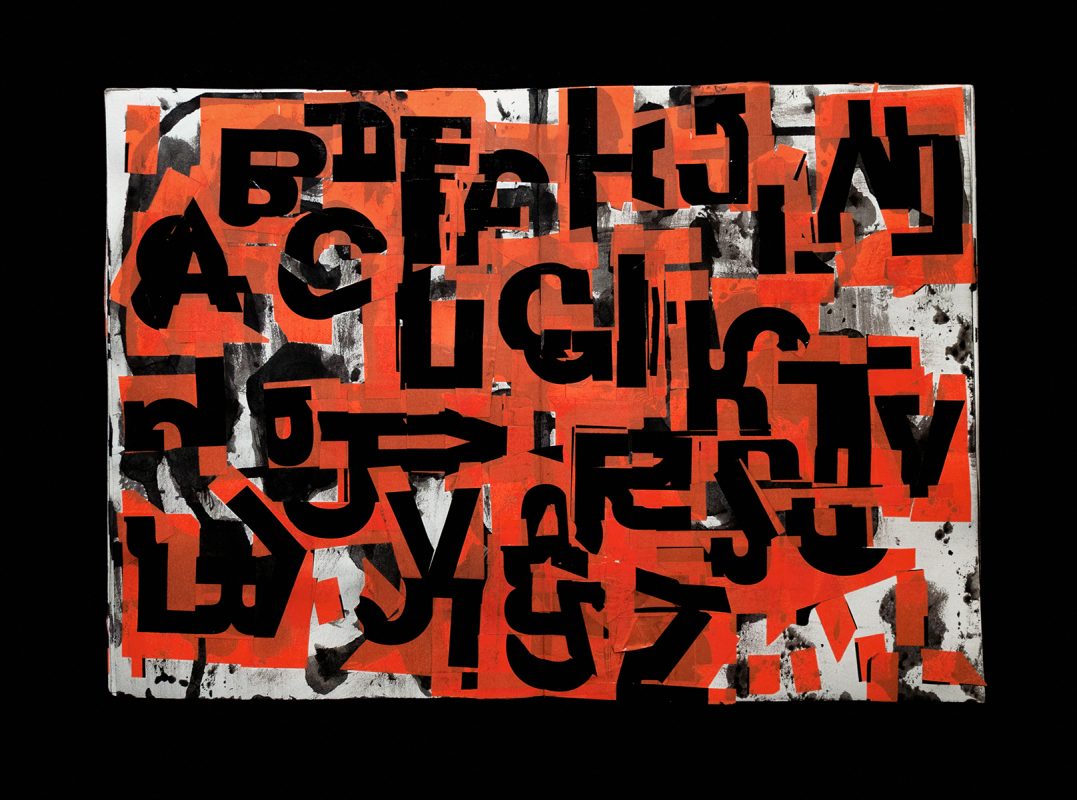
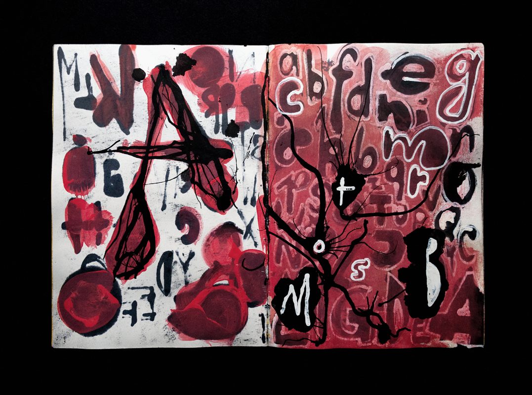
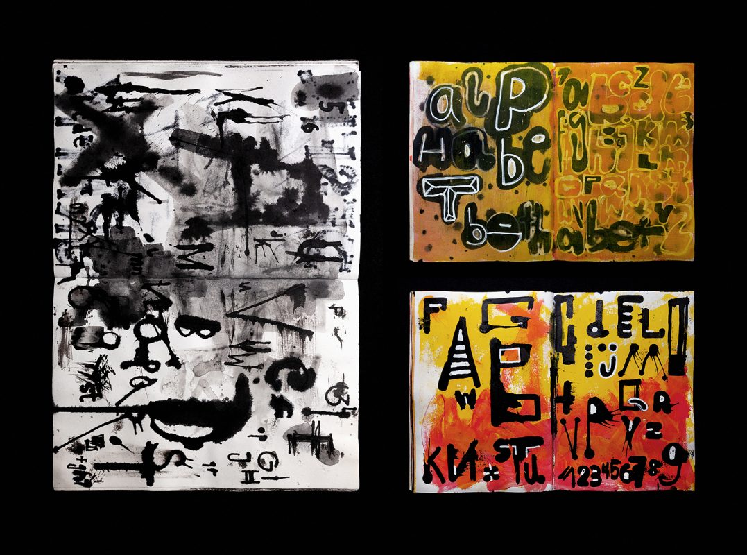
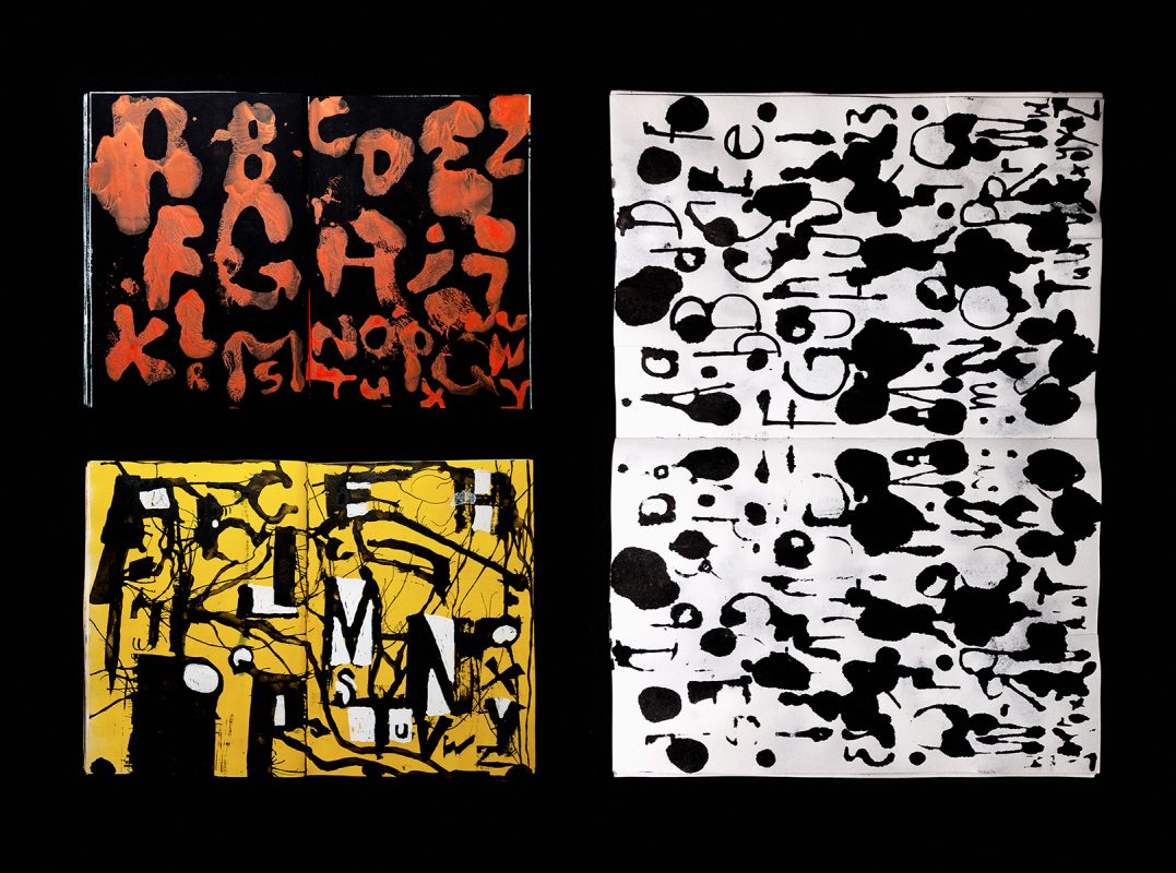
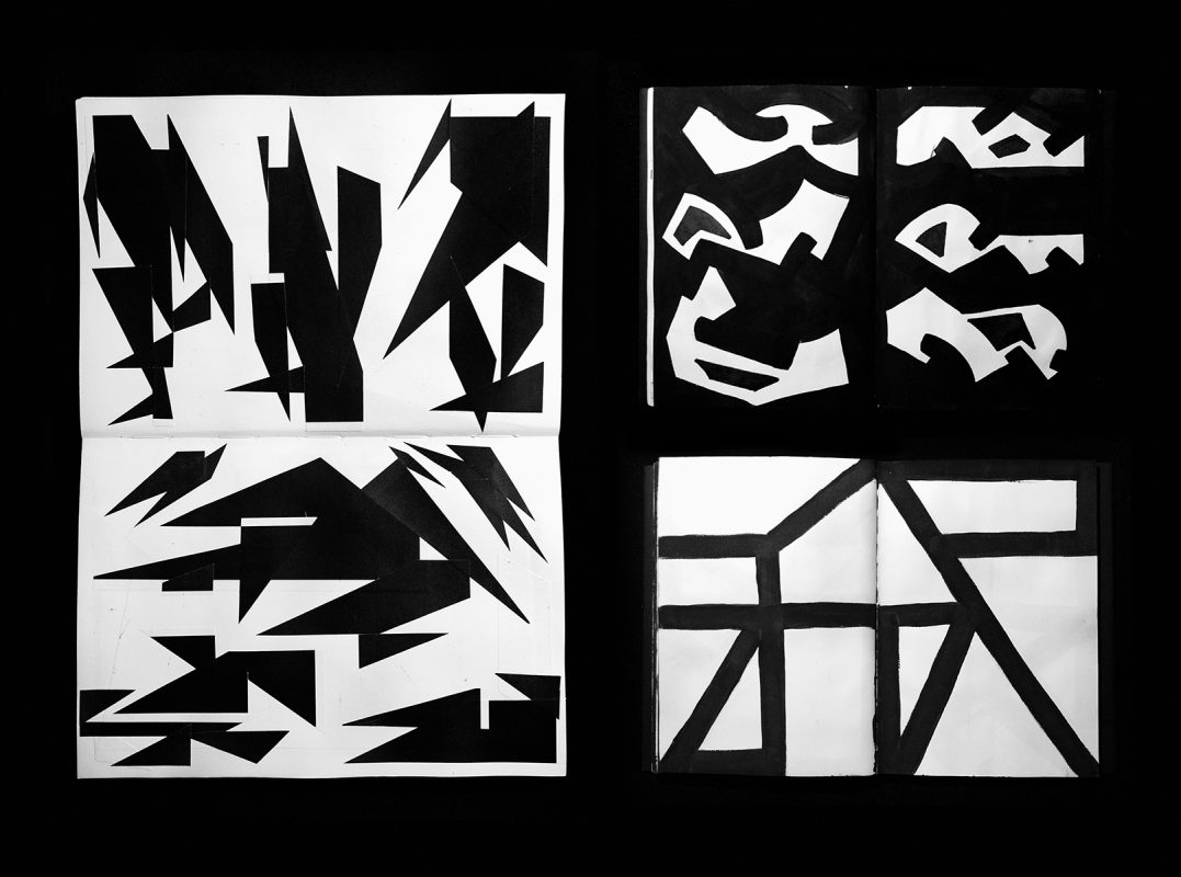
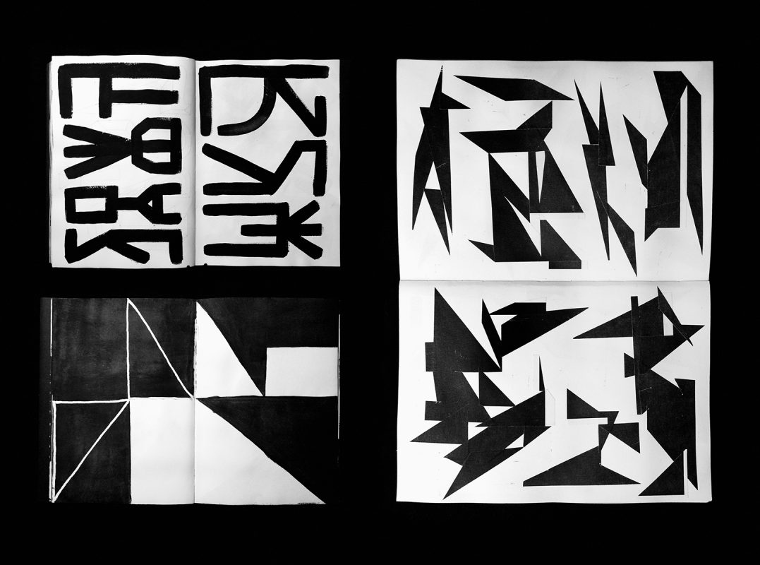
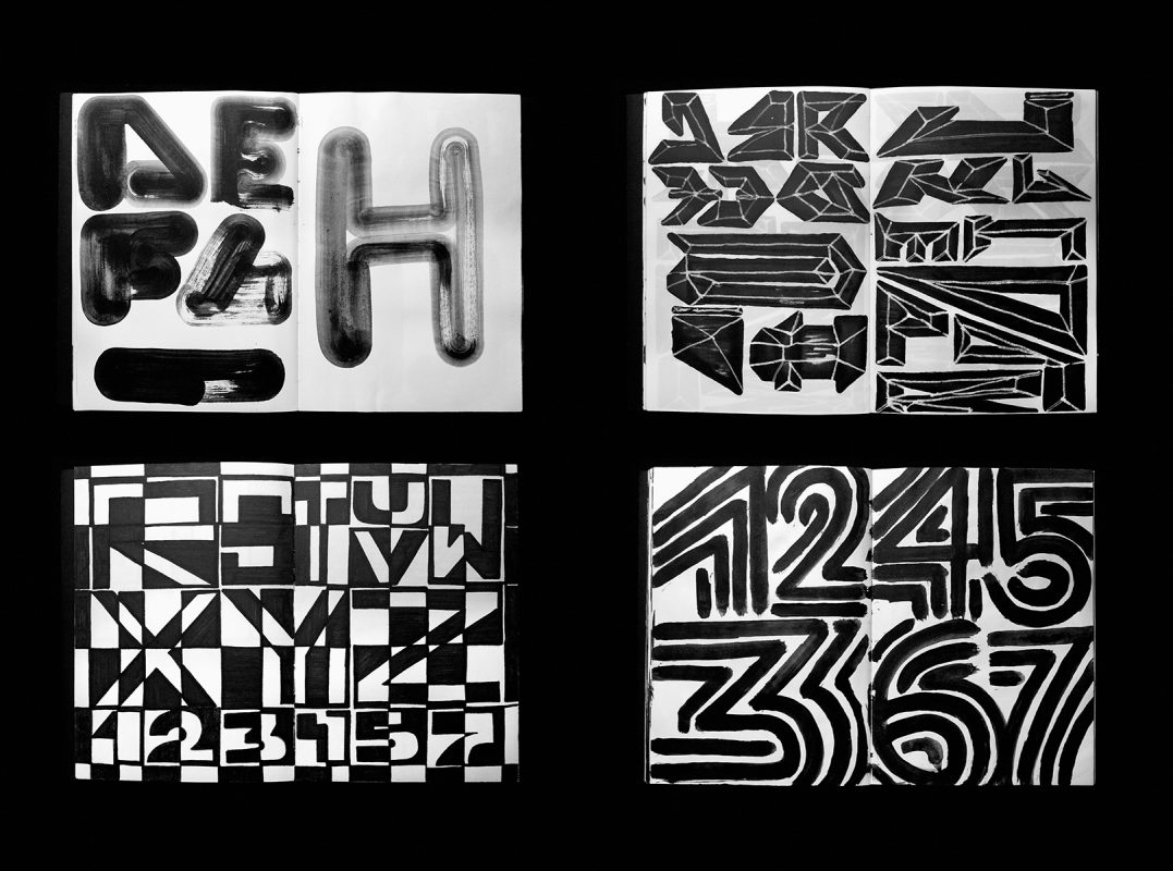
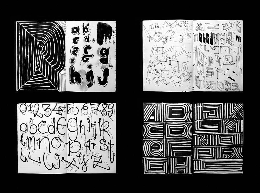
As I mentioned before, my experience in typography was quite limited and I was looking for some kind of starting point to develop a visual language of my own. I was used to sketching in graffiti-blackbooks, drawing my alias over and over again for many years. At some point I decided to swap my pseudonym for the alphabet and established a set of straightforward guidelines for myself: one or more typographic experiments every day, each stamped with the date (for a certain time), only in black and white, compiled in an A5 Sketchbook, 144 pages.
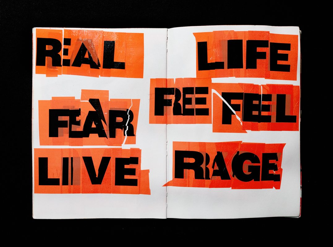
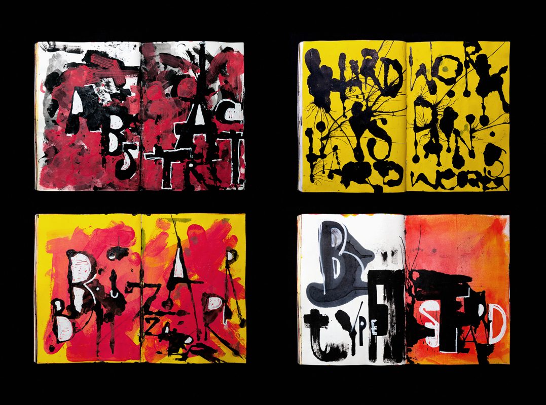
Driven by genuine enthusiasm and sheer joy, I began to draw. My aim was to explore and experiment as much as possible. I tried to transfer my experiences, emotions and feelings onto the pages without thinking too much. Immediacy and allowing myself to ‘lose control’ in a certain way was an important part of the process. I see it as a method which deliberately creates happy accidents and ‘intentional’ mistakes which may lead to unexpected new possibilities and often unusual results. Accidents and mistakes are still a welcome and important aspect of my design practise today. While working in sketchbooks no page or section should be torn out, as mistakes are not seen as misadventures, but rather possibilities of finding and developing new solutions.
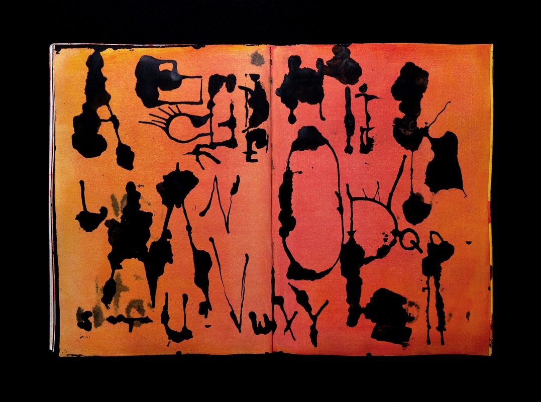
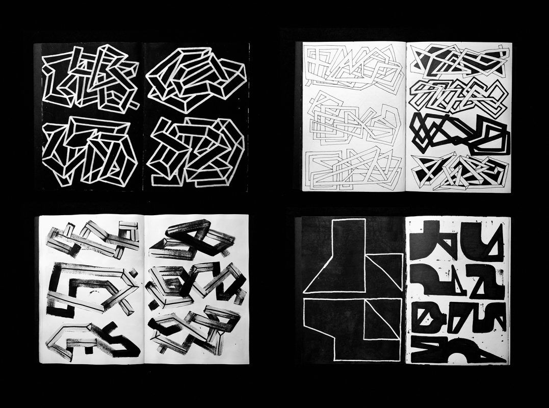
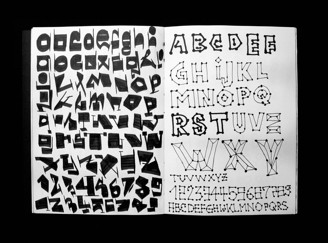
This unedited approach allowed me to maximise the diversity of typographic forms and the richness in their visual shapes. However, after drawing thousands of letters, it became more and more difficult to find new and unexpected shapes without repeating myself. That’s when things actually became fascinating, as I ventured into an area which I haven’t explored before and never anticipated.
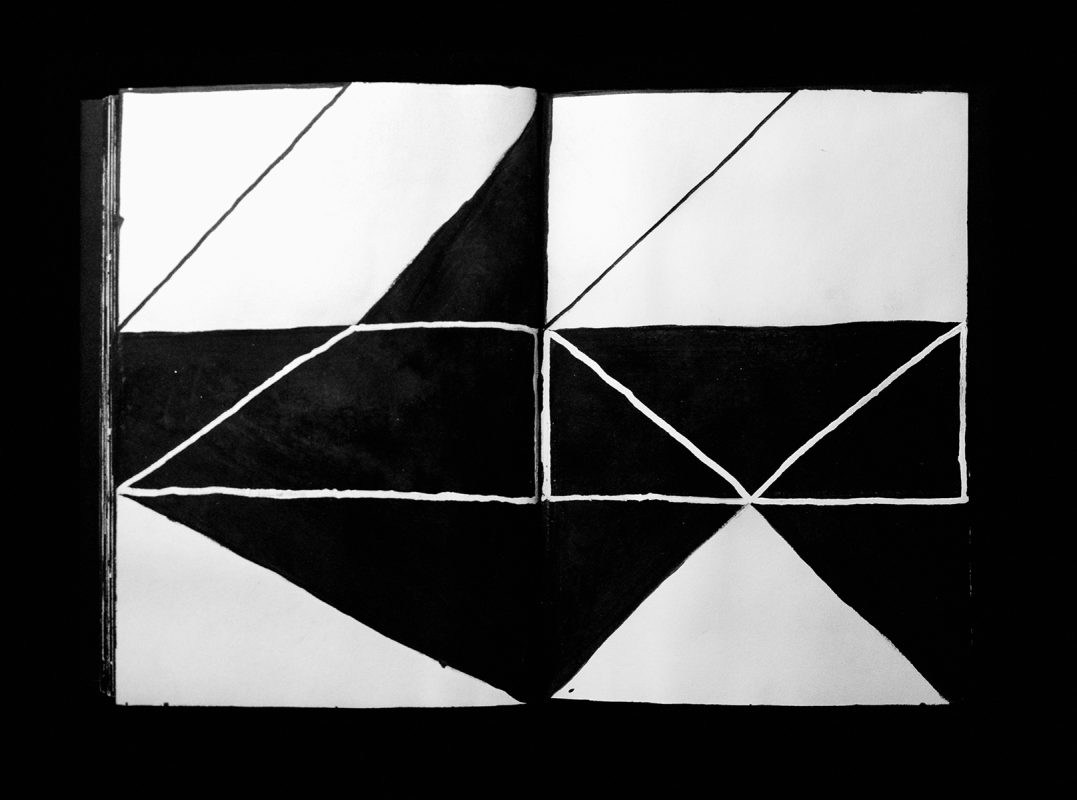
Letters gradually changed into more abstract forms and symbols. I began questioning where readability begins and ends and what factors influence it. I order to find answers to those questions, I temporarily set aside drawing letters completely and focused just on abstract forms using the same methods as before.
Venturing further into abstraction, I discovered a new kind of more personal readability which I would call “emotional readability.” This discovery helped me to understand what I was looking for and also shed some light on the boundaries of design and art, as well as the relationship between content and form.
Today, my sketchbook work represents a rather balanced mix of meditation, self-care, creative exercise and visual research. Drawing in itself is a brilliant workout which trains my visual curiosity, keeps me creatively fit and still pushes me into new areas of interests, e.g testing out new materials, developing drawing tools, colour, composition and so on. The direction those exercises take depends on what I am working on, or what my intention is: commercial practice or artistic expression, expanding my academic knowledge, or just killing time.
Anyway, it is a great source of inspiration and a fundamental for further development, e.g. lettering, type design, spatial design, personal projects, self-initiated publications or running workshops.
Sketchbooks and Collections
A room is usually used by people as a living space or utilitarian area and it is part of a building enclosed by walls, floor and ceiling. Within my personal creative context, I am trying to expand this concept of a space. I define a book as a room with pages, a cover and a spine, in which thoughts – mostly driven by emotions and feelings – and ideas will manifest themselves. Similar to how people operate within a room, the content, letters and symbols are inhabitants of a book. A room can be physical and immaterial – it is a space to think freely, protected from external observation.
Inside of this rather private space everything is visible and on display. Nothing is hidden away. Differences and similarities are collected and documented. Standardized formats, such as A5, promote order, security and create a sense of familiarity. The sketchbook collection keeps a record of what I was interested in or felt at a certain time. In that respect those books contribute to my sense of identity and are an essential part of self-definition and self-reflection. If something has been collected it must have meant something to me and if it meant something at the time then it still matters today as part of a bigger whole. My motivations primarily stem from passion and the intense engagement with a particular subject matter — immersing myself in it.
@tmschmeer
http://luc.devroye.org/fonts-106253.html
The sketchbooks of Pavel Ripley explore both imagery and typography. Collage and ‘the grid’ are explored in this series of engaging graphic forms.
Do you like this artist?
If so, why not write a comment or share it to your social media. Thanks in advance if you can help in this way.