Interview
Interview: Chris Hunt
Jun
In conversation with UK-based screen print artist and Unseen Sketchbooks collaborator Chris Hunt.
What was your journey into the arts?
I think the primary school exercise books in the 1970’s were the gateway; draw a picture then write about it. I would spend a long time making elaborate drawings, with two hurried lines of spaced writing. They allowed for an immersive, inventive and introspective focus that I think is fundamental to my practice now. I love that making art is limitless in its scope, dealing with every human concern, that it can be realised in every imaginable form and its preoccupations are borderless. So interests I have in science, maths, cartography, painting, typography and landscape can all coexist within one activity.
After a 2 year general diploma in art, I opted to study a degree in Printed Textiles at WSCAD in Farnham in favour of graphic design. It was a craft-based course which emphasised a sound practical knowledge. Influenced by the printmaking course, my work took a fine art direction and I produced large mixed media wall hangings. After graduation I applied for a job as a fine art screen printer, which I have been doing ever since.
Can you talk about the collaborative nature of your work. You often work with artists and designers, how do you find this process?
Screen printing attracts a diverse mix of clients from museums, graffiti and fine artists to graphic designers, so no two jobs are the same. It’s been important for me to be adaptable and sensitive to the work – the treatment of printing a watercolour is unlike a piece of pop art but the characteristic essence and integrity of the images have to be captured. I have screen printed fine art editions of between 50 to 500 copies using 10 to 40 colours laid down with separate screens. It is a time-consuming process that often prohibits an artist being in the studio everyday making decisions.
Generally the edition is printed to a stage of finality, and then the artist’s input is sought and changes are made. Some artists are inflexible about any deviation from their original, some are happy to see the translation, it’s most satisfying when the print takes on a life of its own and is developed in response to the process. My job is to take the image apart and then to piece it back together. This requires a depth of experience and knowledge of colour interaction but also a steady nerve and confidence that you are making the right decisions with each stage. After separating the work into individual pieces of artwork for each colour, the ink is mixed, proofed to the original artwork and then printed consistently on the edition – seeing a stack of white paper become a finished edition can be a very rewarding (printing 40 colours on a larger edition is a feat of endurance)!
Working with students is refreshing because they are confronting the limitless options of the process and aren’t yet defined by their practice, which allows the unexpected and spontaneous to occur. It’s more playful.
My work with Unseen Sketchbooks is exciting because both Chris Bigg and Jim Stoten have an understanding of the process but also embrace the ‘inkyness’ of the outcome: the wobble of misregistration, the build of ink or the imperfections of squeegee pressure.
The printing of Jim’s cover was an enjoyable challenge to capture both the detail and the range of colours using only 7 stencils. Because Chris Bigg’s designs are so robust, it was possible to have a more ‘shoot-from-the-hip’ approach, and allow variation and the unintentional to define the outcome.
For both projects the strike sheets have been as cherished by Unseen Sketchbooks as the intentional printing. The strike sheets are the printer’s proofs or random sheets of paper used to establish that the screen is printing correctly, they are often discarded and rarely seen by anyone other than myself. They can throw up surprising results, appear more complex than they are and I often use them to create arbitrary compositions that can feed into my own work.
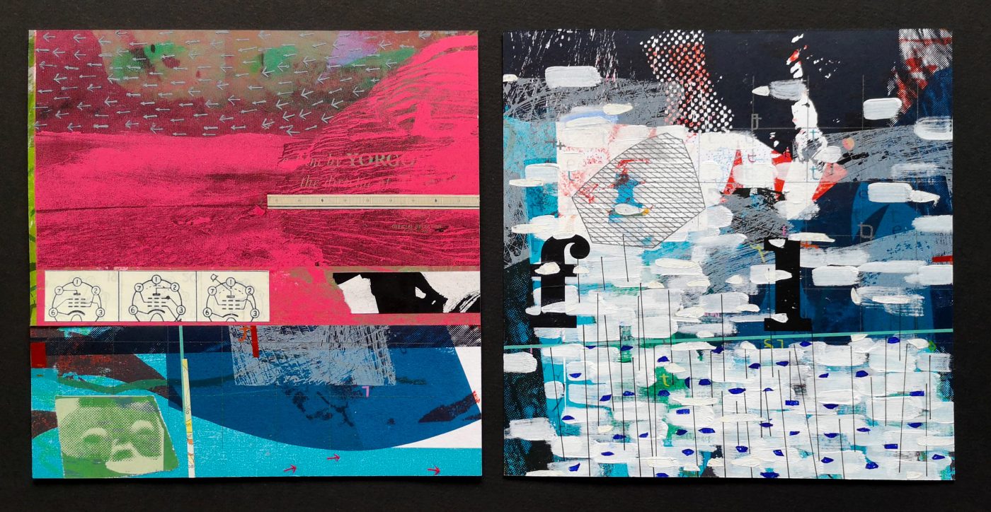
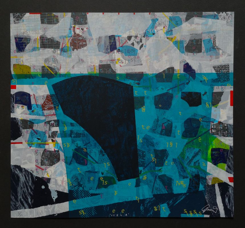
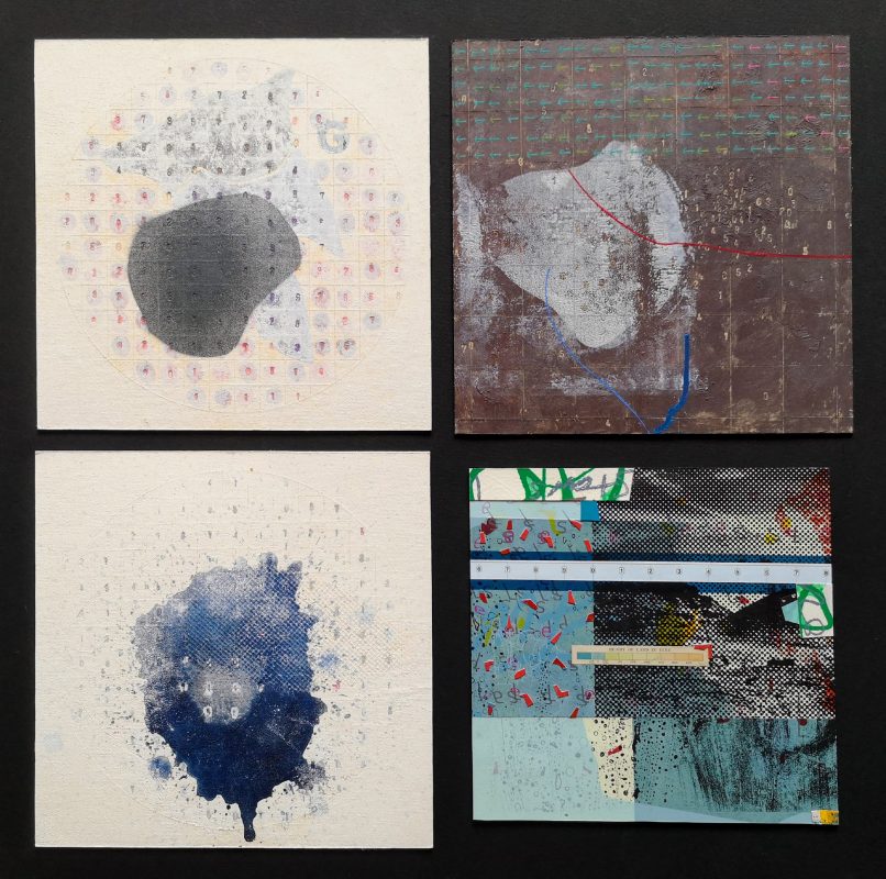
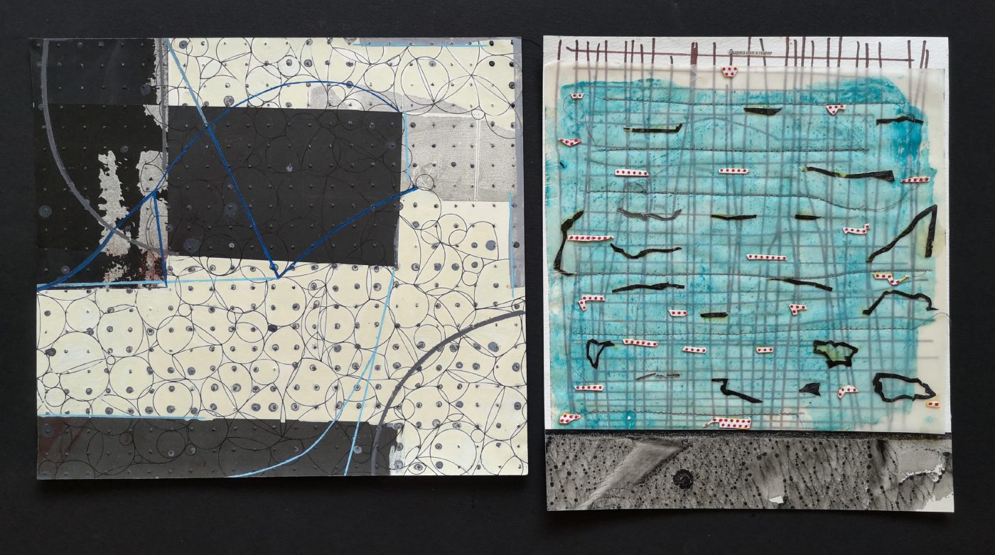
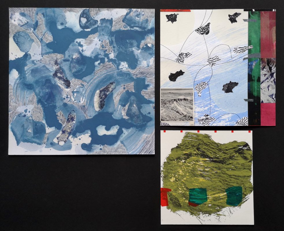
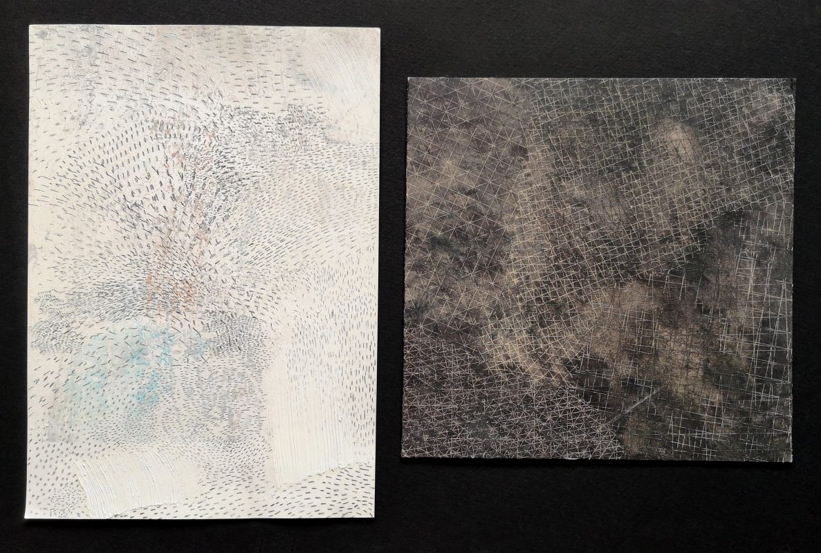
Your personal work explores both printing in what might be considered a traditional sense, but also elements of collage and materiality, or physicality to your work. Can you talk about your processes and influences?
The materiality probably stems from my study of textiles, which emphasised an understanding of the structure of fabrics, the chemistry of the process and pushed experimentation. The ability to alter fabric is much more radical than printing onto paper, the techniques are far more wide ranging. Rushton Aust visited as a lecturer and his complex wall hangings influenced my own work.
Much of the fine art printing I have produced has used multiple layers and finishes that give the prints a painterly, tactile quality that is lacking in other modern processes.
Antoni Tàpies’ mixed media paintings, Robert Motherwell’s works on paper and Terry Winters whole output have influenced my aesthetic. I do paint, but I paint like a printmaker: building in layers, halting and progressing. The use of collage has allowed me to explore radically different compositions quickly and more intuitively, as proposals for creating complex, larger screen printed work.
Your work often uses layerings of found and created items that link to maps and landscapes, can you talk about where this interest comes from?
I grew up in the West country and drew a lot from nature. It occurred to me that I was looking at landscape that wasn’t just a view but a scape that had evolved geologically, been affected by human influence, that was in flux and influenced by the elements, had been mapped and measured, and recorded history. The layering is an attempt to depict those places as an accumulation of all of the information – a dissection of the landscape that is viewed from a multitude of viewpoints simultaneously, and borrows visual language from many sources. A synthesis of landscape and place.
What’s magical about printmaking is the ability to combine images, surfaces or textures one on top of another using different levels of transparency and opacity, in both a controlled or chaotic fashion. I also like the interplay of hand drawn and digitised images and textures. The challenge is orchestrating all of these layers.
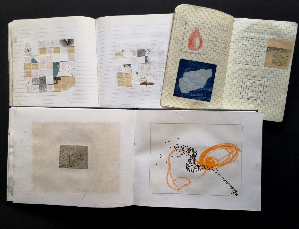
Do you use a sketchbook or journal? If so, can you talk about how you use this. Is it or your sketches a record of what you do or does it inform your approach and thinking?
I have a trove of unfinished sketchbooks, notebooks, collected images and photographs, which sometimes combine in one book. If they do combine they tend not to be chronological or have hierarchy, it’s often just what’s nearest to hand. Sometimes the bound and linear format of the sketchbook can exhaust or restrict the ideas, so recently I have been working in a series of loose-leaf sheets that are a set format but with few preconditions.
I often record a word or phrase which in turn triggers a visual idea; Robert MacFarlane’s dissection of being in wilderness has resonated. I also kayak in the sea, run and cycle – they are times when I respond to the landscape, feel inspired and think through an idea that ends up on paper or in a painting.
The tension is introducing all these elements into the work but not toppling it over with clutter.
Do you like this artist?
If so, why not write a comment or share it to your social media. Thanks in advance if you can help in this way.